BRAND IDENTITY DESIGN FOR MUCKY BOOTS KINDERGARTEN
I am delighted to share with you the initial logo concepts for Mucky Boots, designed to reflect the spirit of your outdoor kindergarten. These designs are based on the natural, playful, and nurturing environment that Mucky Boots offers to young children.
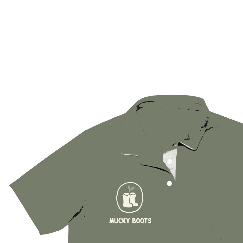
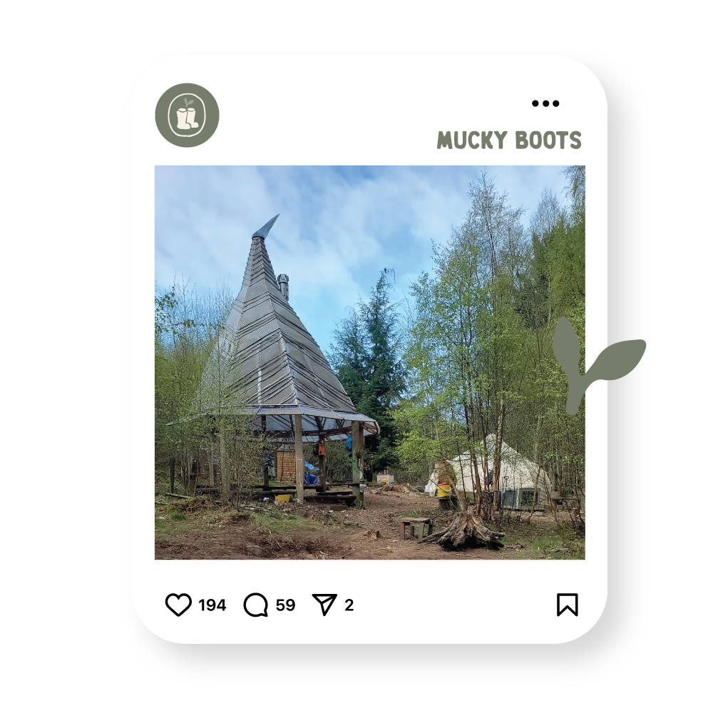
This project aims to create a cohesive and memorable brand identity that can be used consistently across all areas of communication — including printed materials, your website, social media, and branded items. Each concept has been developed to be simple, playful, yet professional, ensuring it appeals to both children and adults while remaining versatile and impactful in a variety of formats.
A key element across all designs is the welly boot, which has been incorporated not only as a recognisable symbol of outdoor play, but also as a representation of opportunity and curiosity.
As you scroll down, you’ll find three different concepts to choose from. The idea is to find the style you are most drawn to, and from there, we can tweak and refine your chosen design.
Deliverables: Main logo • Secondary logo • Sub mark logo • Colour palette • Core value icons • Typography
NEXT STEP :
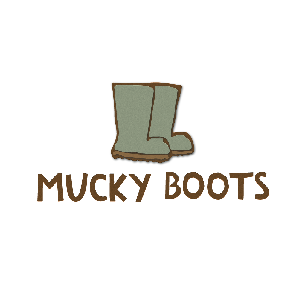
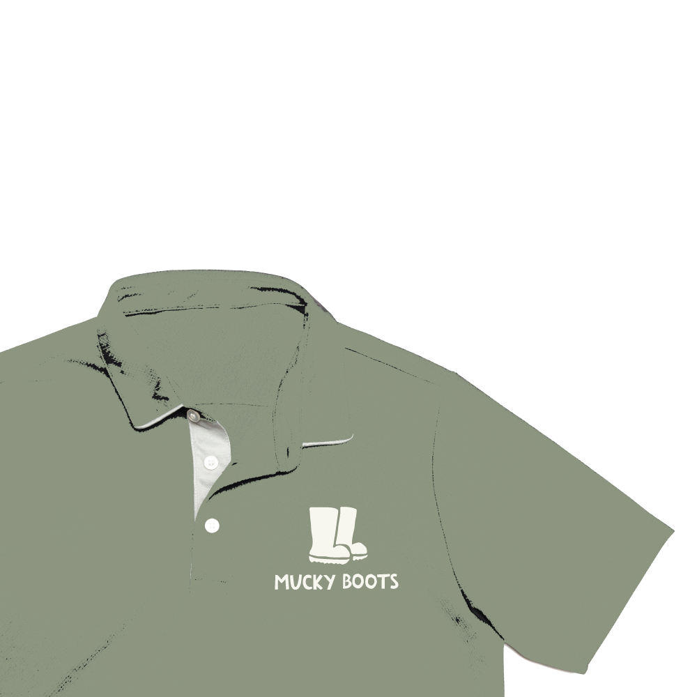
CONCEPT ONE
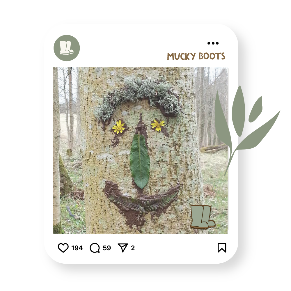
Sharp, cut-out edges to evoke a childlike, imperfect feel, reflecting the playful and exploratory nature of Mucky Boots.

CONCEPT TWO
Incorporating richer, earthy tones to evoke a preschool feel, while symbolising nurturing and growth through the flourishing flower.

CONCEPT THREE
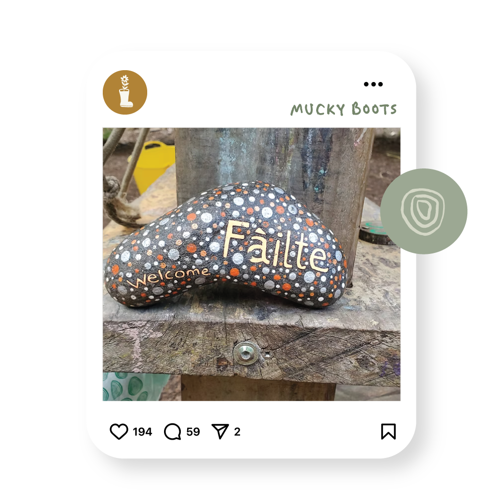
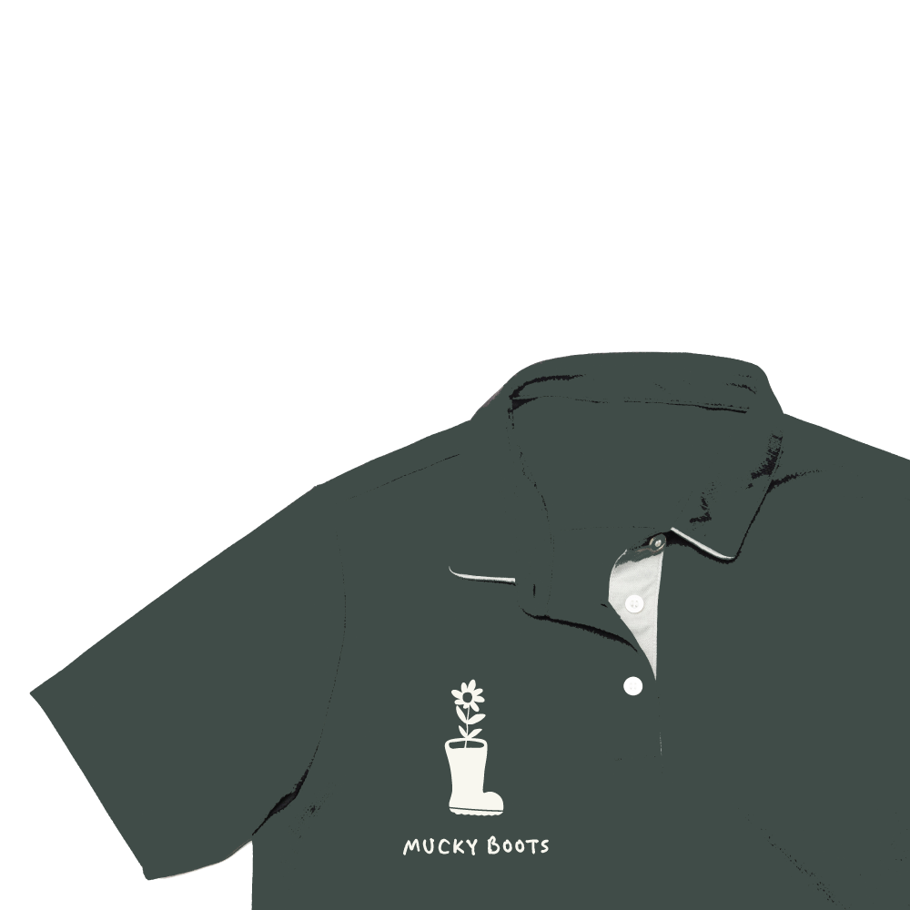
A design embracing a simple, childlike style, standing out through its simplicity and highlighting growth and connection with nature, from the boots to the leaves.
